Colours may appear different on your screen. Please check your colour on the Sigma colour-chart instore, or try a sample before purchasing.
RAL 3016
S 3050-R90B
S 4020-R90B
RAL 7037
RAL 9016
Monochromes have become increasingly popular over the years, but not everyone
knows how to turn their house into a Pinterest board. Today we teach you how!
RAL 3016
S 1030-Y70R
S 0505-Y20R
S 6010-G90Y
S 4050-B10G
S 1015-R90B
S 2020-R40B
We’ve scoured the web to identify the top trending colours
for the year to keep a constant stream of fresh ideas coming your way.
S 1030-Y70R
RAL 5013
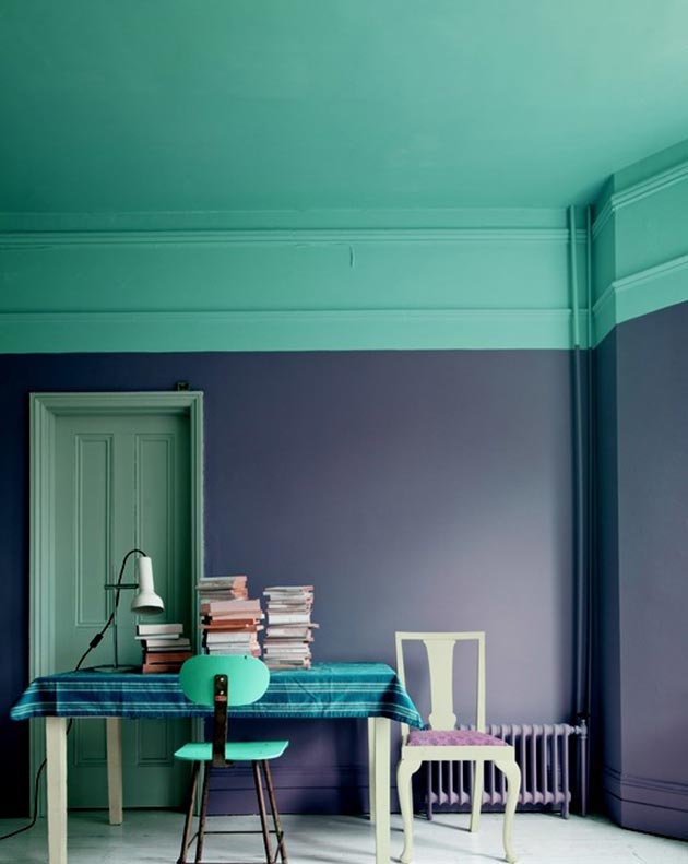
Opposites attract right?
Add a second dimension to your walls by introducing darkness to the light.
RAL 5013

S 4050-R40B
S 4050-Y80R
RAL 1032
RAL 6001
S 2040-R10B
If you’re seeking to stay on track with the trend,
check out the 10 colours Pantone recommends you adopt this fall!
S 4050-R40B
S 3555-B60G
Choosing one paint colour can be tricky.
So…why not just go for three?
S 3555-B60G
RAL 9011
Patterned and textured walls to achieve the decor goals you’ve been striving for.
Here are a few secrets that will save you sacrificing an extra penny.
RAL 9011
S 1020-R20B
From childish and perky to suave and sophisticated.
Here’s how to use Rose Quartz – Pantone’s 2016 colour of the year!
S 1020-R20B
RAL 9018
RAL 9018
S 3050-B10G
S 3020-B30G
Tell us which of these are your favourites – join the conversation on Facebook!
S 3050-B10G
S 1040-R10B
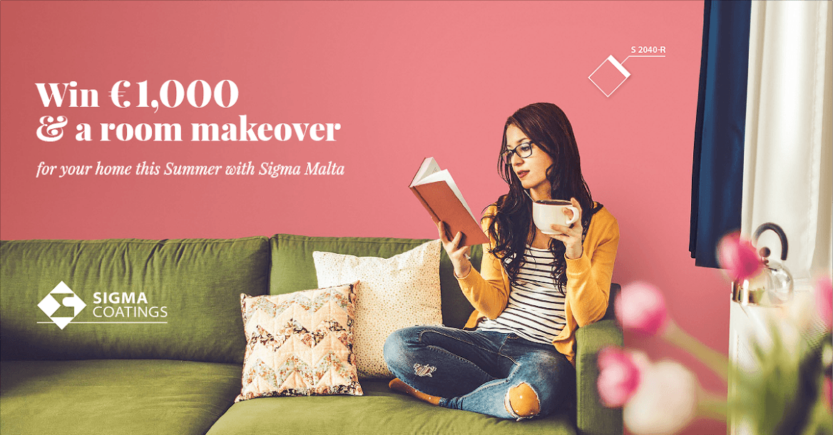
It’s here! Are you ready?
The Masterpiece Makeover Competition starts NOW.
Send in your makeover mood board for a chance to be one of our 10 winners! Click for details.
S 1040-R10B
S 0520-R
If you only like your flowers in pots, this one’s for you.
Read more >S 0520-R
S2570-Y80R
It’s that time of the year.
Are you ready for it?
Pick your favourite shade.
S2570-Y80R
S 4040-Y90R
No, we’re not talking about the wine – although we wouldn’t mind some of that either.
We’re talking about the hearty yet stylish tone described as a “subtly seductive shade,
one that draws us in to its embracing warmth” by none other than Leatrice Eiseman,
Executive Director of the Pantone Color Institute herself.
Here’s what’s inspiring us to use this earthy tone at home!
Read more >S 4040-Y90R
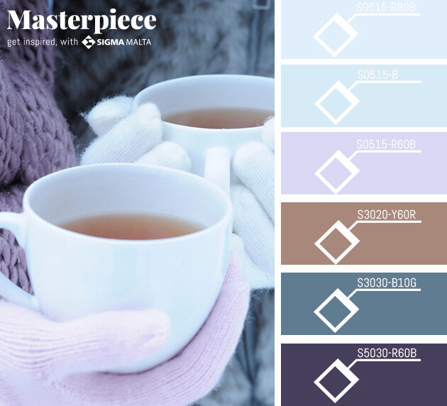
S5030-R60B
Tired of the traditional
Christmas colour schemes?
Here’s an idea.
S5030-R60B
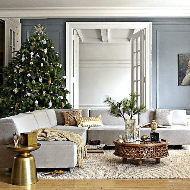
S 3010-B10G
Christmas decor doesn’t have to be gaudy.
Thankfully, there are alternatives. Classy ones. Modern ones. Absolutely gorgeous ones.
Decor that fits into the rest of your home as opposed to sticking out like a sore thumb in green and red.
We’re sharing our favourite Christmas decor ideas based on the colours so many of us have around the house – neutrals!
Read more >S 3010-B10G
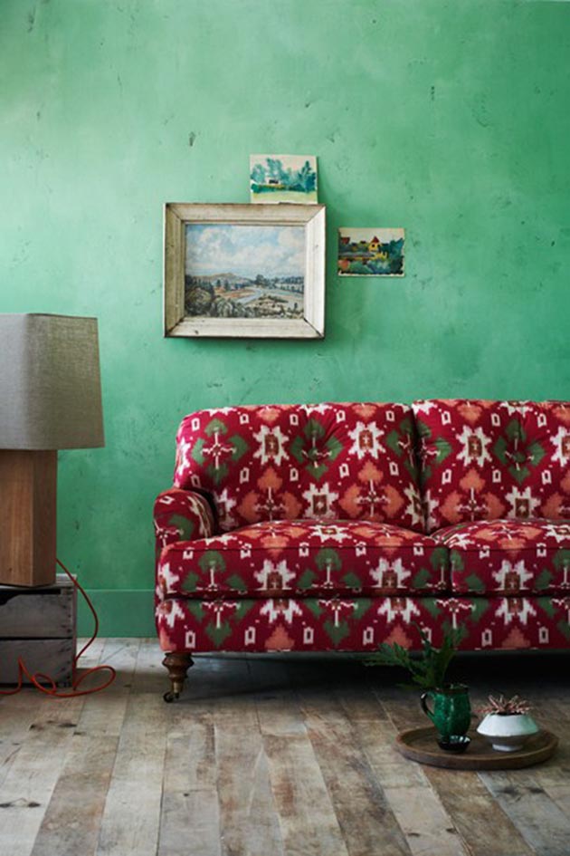
S 2040-G
Sofas aren’t always glamorous.
They’re usually covered in stained throw-overs and dismantled by kids to make forts in the living room.
But sometimes, a magical piece of furniture makes its way into your home.
A giveaway that’s considered too lurid, or a “dated” number whose potential hasn’t been recognized.
What can you do with it? Well, the real question is, where to begin?
Read more >S 2040-G
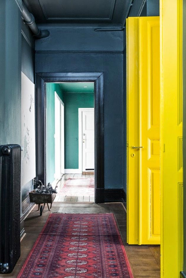
S3030-B70G
This month’s contribution to the Masterpiece designer blogs features
the interior design experts at Loft Malta, who tackle the common myth
surrounding dark walls and tiny rooms.
S3030-B70G
S3050-Y40R
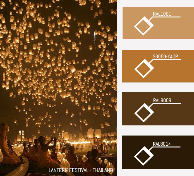
The weather’s cooling down and we’re
loving these warm shades of Thailand.
S3050-Y40R
S1080-Y40R
We’re cosying up to the idea of Autumn. What about you?
S1080-Y40R
S2060-G10Y
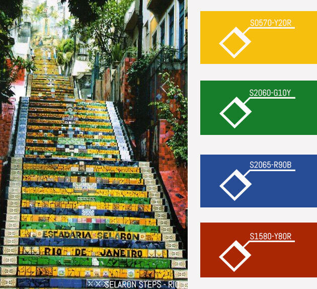
Can you believe it’s been 3 months since the World Cup Final?
We’re still dreaming of Brazil…
S2060-G10Y
S 1050-B10G
The colour gods have spoken, and they’re seeing the future:
Pantone have finally released their colour report for Spring 2015!
See how you can incorporate the shades into your home decor.
S 1050-B10G
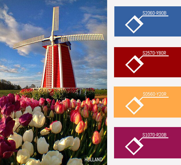
S0560-Y20R
This tulip-toned colour palette made us smile 🙂
Have you ever been to The Netherlands?
S0560-Y20R
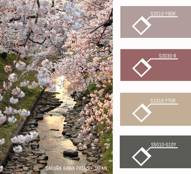
S2010-Y90R
Hit that ‘Like’ button if Japan is on your bucket list!
S2010-Y90R
S 5020-Y60R
This month’s contribution to the Masterpiece designer blogs comes from the
brilliant Christopher Cauchi, who gave us a sneak peek into one of his latest design
projects for a residential property!
S 5020-Y60R
S1050-B30G
We’ve visited 10 countries so far.
Have you visited more or less?
S1050-B30G
S5540-B30G
We’re travelling the world week by week – this time we’ve hit the States!
S5540-B30G
S 1030-B50G
Decor Dare: Next time you pick a new colour for the room, start at the top.
Yes, we’re serious. Ceilings need colour too!
Read more >S 1030-B50G
S3060-B
You have 3 weeks off. Where would you go?
S3060-B
S 2002-G
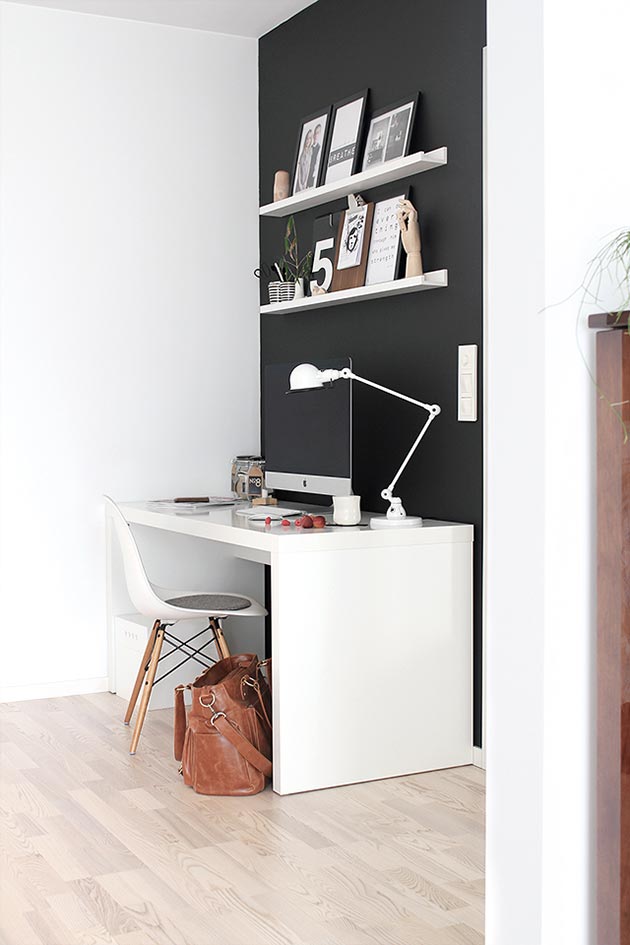
We’re caught up in Black Magic.
Dark, dramatic, and positively bewitching, black rooms always make a striking statement.
Not convinced? Click through to get inspired!
S 2002-G
S33050-Y80R
Oh, what we wouldn’t give to be here right now. What about you?
Join the conversation on Facebook!
S33050-Y80R
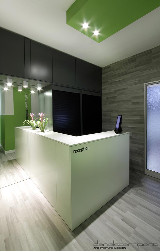
S 1040-G20Y
This month’s contribution to the Masterpiece designer blogs comes from the
experts at Daniel Scerri Periti, who gave us a sneak peek into their stylish and
bold colour choice for their dental clinic project!
S 1040-G20Y
S6030-R10B
It’s hot. And we wish we were here right now. At least the colours will keep us cool!
S6030-R10B
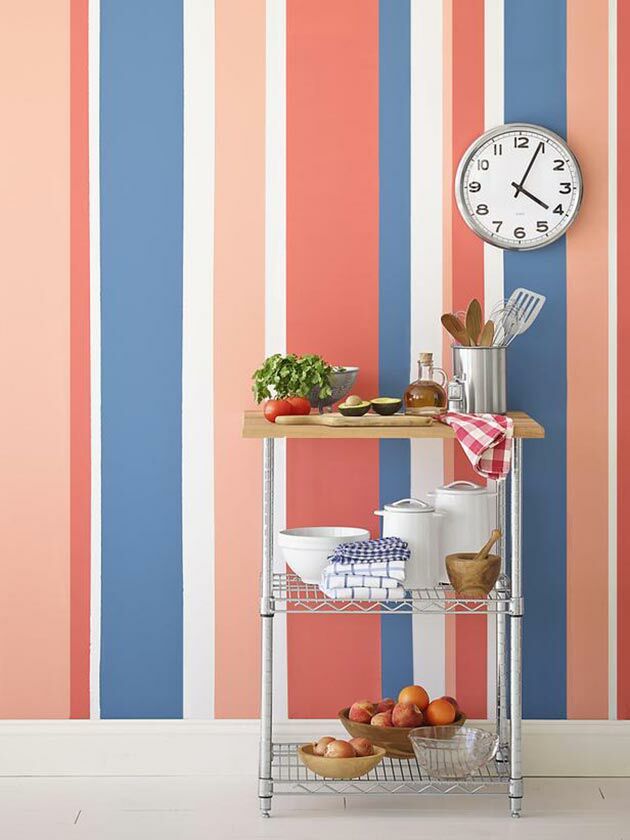
S 1060-Y80R
Call your rooms to attention with everyone’s favourite pattern:
Sensational Stripes!
S 1060-Y80R
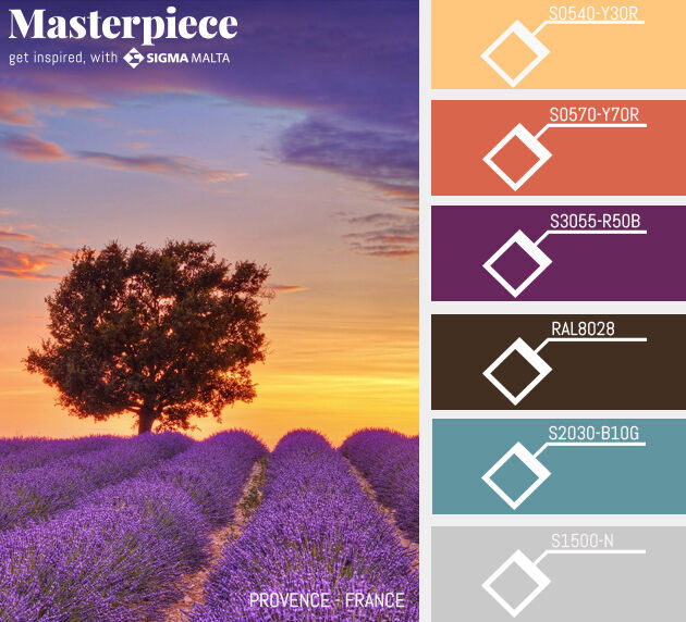
S4040-R60B
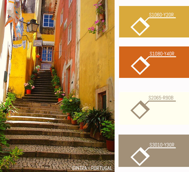
This week, we’re dreaming of Provence.
S4040-R60B
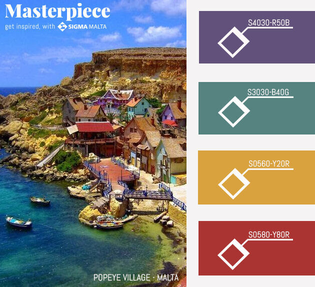
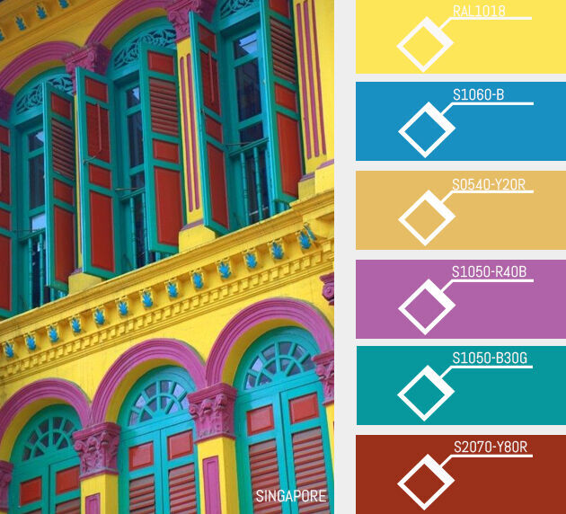
S0560-Y20R
In this edition of Where in the World Wednesdays,
we’re looking to Malta for gorgeous colour inspiration.
What’s your favourite spot on the island?
Join the conversation on Facebook!
S0560-Y20R
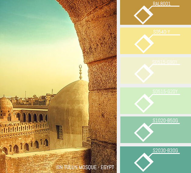
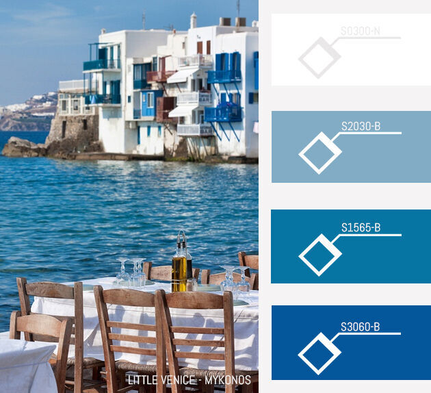
S 0515-G20Y
It’s our second in the Where in the World series!
Every Wednesday, we’ll be delivering fresh colour inspiration
from our favourite spots around the globe.
This week, our minds are wandering to beautiful Egypt.
S 0515-G20Y
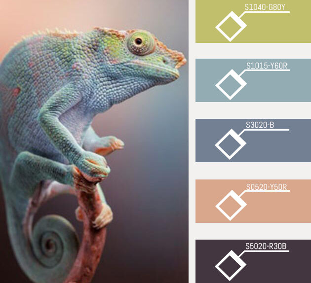
S 1515-G
Choosing a paint palette for your home can be a daunting experience,
but there’s a trick to making it easy: Look to nature!
The most perfect colour combinations are always found in the natural world,
so we’ve got a few palettes together to get you started.
Read more >
S 1515-G
S 2565-R80B
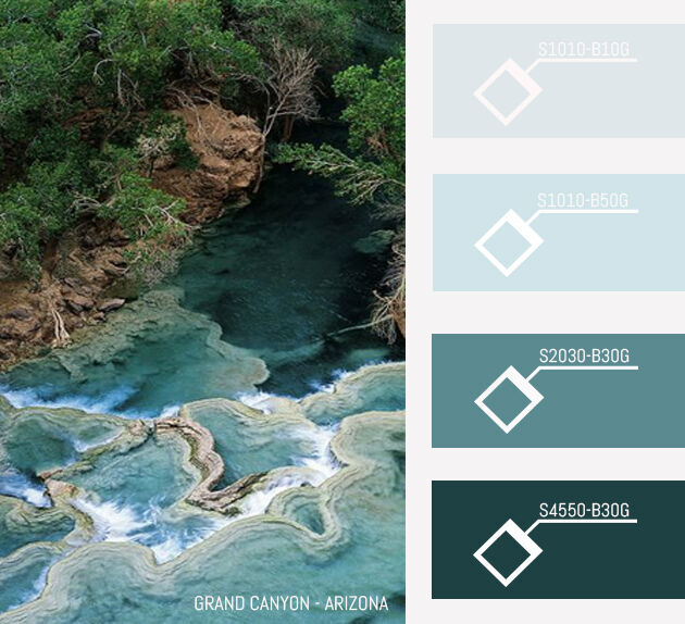
We’re kicking off our Where in the World series!
Every Wednesday, we’ll be delivering fresh colour inspiration
from our favourite spots around the globe.
This week – Peru!
S 2565-R80B
S3030-R60B
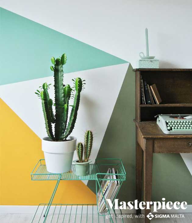
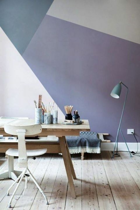
S 3020-B30G
S 2000-N
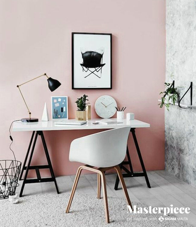
A simple space like a home office, craft room or spare bedroom
can be brought to life with a no-fuss design on the walls.
S3030-R60B
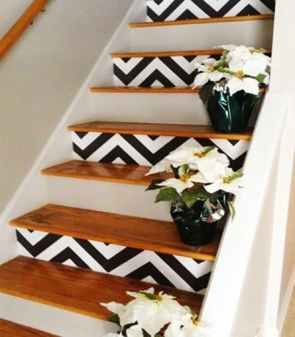
RAL 9016
We love the way they painted every other stair, so it’s not overwhelming.
It’s a playful pattern, but done in black and white to add a touch of sophistication.
RAL 9016
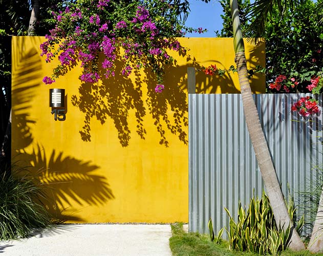
1076-Y13R
You’ve had it with the beige. Those walls you’ve been looking at for months and years just don’t do it
for you any more. You’re after something modern, something edgy to spice up your home decor.
You’re looking for inspiration and you’re willing to consider almost any colour – blues, purples, pinks even.
We’ll bet you one thing though, you’re probably not thinking yellow.
Right?
1076-Y13R
S 4050-B50G
Here are 10 common mistakes people make when choosing colours for their homes
– and how to avoid making them yourself.
S 4050-B50G
S 0550-Y60R
Nothing special, just a chair and table against a wall.
But that colour. Oh, that colour.
S 0550-Y60R
S 0510-B10G
S 0530-G60Y
S 1040-B30G
S3030-R80B
S 4050-R20B
S 2065-R20B
A fun, summery aubergine palette by DesignSeeds.
S 0510-B10G
Currently coveting brick red —who's with us? See the full home here: http://t.co/cFzpK1Uyv1 pic.twitter.com/lNFD0yBtPq — ELLE DECOR (@ELLEDECOR) June 27, 2014
S 3560-Y80R
The B Five Studio team conjures a refined vision of country life,
where understated luxury pays homage to a setting of unparalleled verdant beauty.
S 3560-Y80R