Colours may appear different on your screen. Please check your colour on the Sigma colour-chart instore, or try a sample before purchasing.
Another month, another exciting designer project to share with you. This time, we’re headed to the picturesque seaside village of St Paul’s Bay.
Now we understand that when you head to a seaside village in the middle of summer, a dental clinic is probably the last thing on your mind. But hey, you never know! You might just need to pop in for a check up – and when you do, we’d bet you anything that you’d wish it looked as good as this one does.
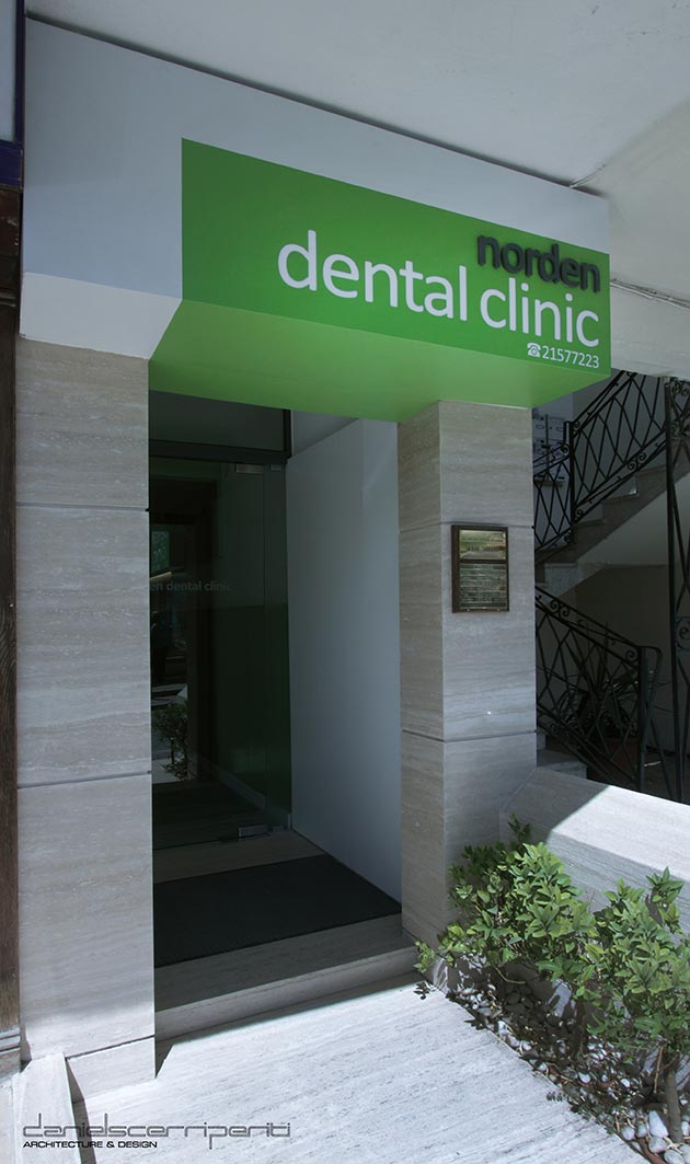
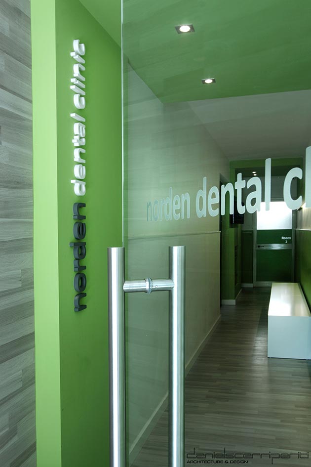
Introducing the Norden Dental Clinic project designed by the architects Daniel Scerri and Rebecca Zammit of Daniel Scerri Periti. Their job was to take the existing dental clinic and give it a much-needed revamp. Their brief? It needed to look fresh, modern and clean. Here’s how they tackled it:
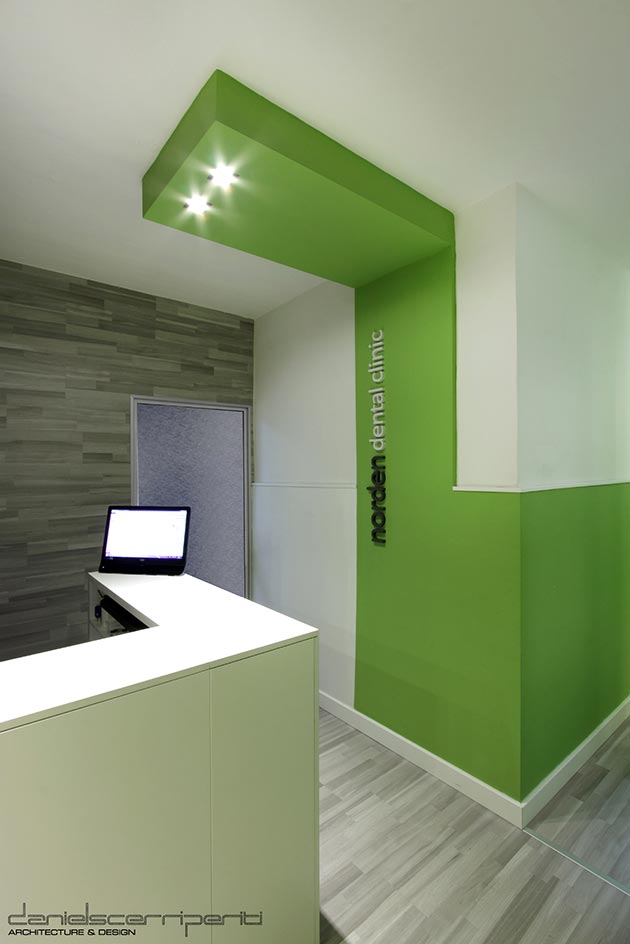
 “We started by taking a good look at the logo. It was green in colour, originally derived from the green pharmacy symbol used on the premises in the past, and therefore there was a particular history that the clinic associated with the colour green. Now, going with green is no easy feat. We were wary of the colour. It’s usually avoided by most as it’s difficult to use in interior design. That didn’t stop us though – we trawled through the multitude of shades of green in existence and carefully picked out a particular lime shade, as it worked well against white and a neutral grey background.
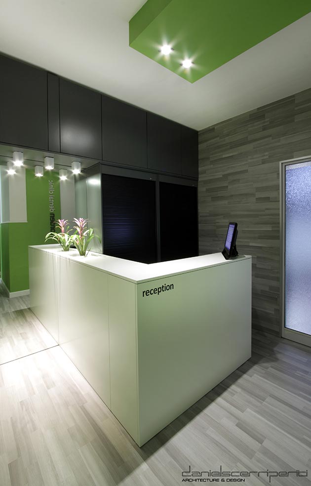
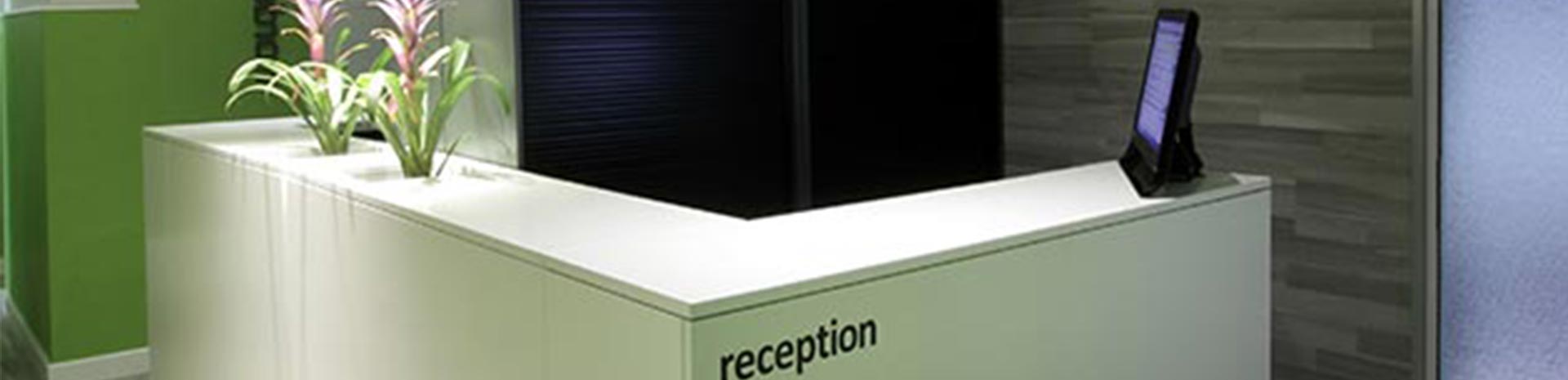
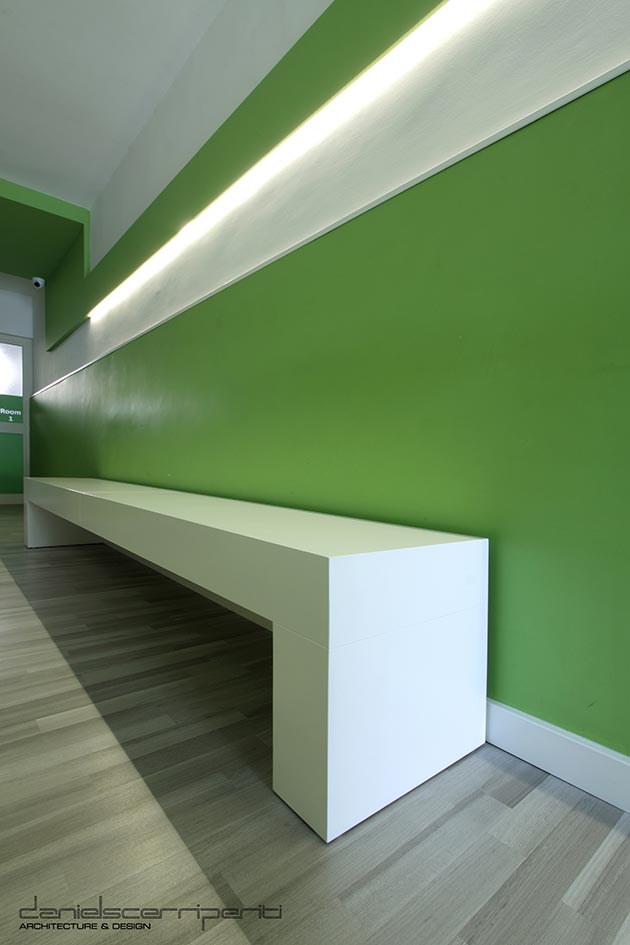
The result? Well, you can see that for yourself. It’s a fun green, yet still somehow serious and relaxing. More importantly, the colour gave a vital breath of freshness to the clinic, which was a priority due to the limited size and space of the rooms.
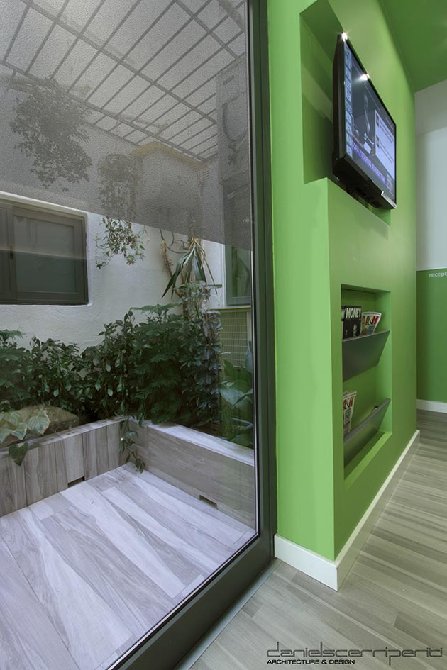
Also, did you notice that the main room is essentially one long corridor? Probably not. You see, the white stripe along the green wall added layers to the length of the room, breaking it up in the mind’s eye to create interest and bring a dynamic feeling to the space.
Finally, by looking at photographs of the green contrasting against the crisp white, you’re probably thinking of freshly cut grass, health and cleanliness. The last thing you’re thinking of is that dreaded dental chair, and well, that’s exactly the point.”
Photographs by David Pisani – Metropolis
Great stuff guys, we really love the end result – a bold, stylish design that’s crisp and clean enough for not just any workplace, but a dental clinic!
There’s more where that came from, of course. If you’d like to find out more about Daniel Scerri Periti’s work and projects, you can find them on their Facebook page.
What do you think of the project? Let us know in the comments below!
Comment:
Talk about it!