Colours may appear different on your screen. Please check your colour on the Sigma colour-chart instore, or try a sample before purchasing.

There’s power in paint. When done well, a fresh coat of paint will make a room feel clean and bright. When done badly, though, it can make a room feel small, busy, or drab. It’s the never-ending dilemma faced by homeowner and designer alike – what colours should you go for?
Here are 10 common mistakes people make when choosing colours for their homes – and how to avoid making them yourself.
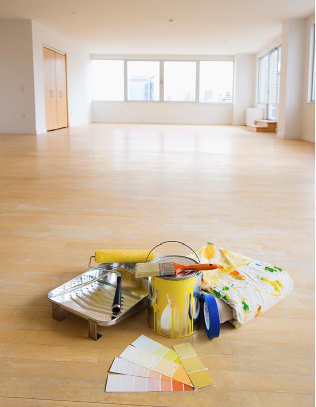
1. Going to the paint store unprepared.
Take samples of everything that might be used in the room – from furniture to carpets and fabrics. If you can’t take an actual sample of the item, find something that colour that you can use instead. That way when you have the paint in hand at the store, you can see the entire palette laid out in front of your eyes.
2. Looking for colours that exactly match favourite objects
If you want your favourite accent piece to stand out in a room, choose colours that are similar but softer. Instead of choosing the exact green in your favourite pillow, for example, choose a green that is lighter and more subtle, so the rich green of the pillow pops.
3. Picking a colour that’s too bright or saturated
“A bright cobalt blue, can look great as a ceramic lamp, because it has a sheen to it, or as a silk pillow, because it has depth or interest, but when you put that same really bright colour on the wall, it’s a whole lot stronger. Lighter, muddy colours (meaning they have more gray or black mixed in with them) work better than a really bright strong hue.” –Tobi Fairley
If the walls are going to scream a bright colour, you want to wrap the rest of your furnishings in neutral tones, or even white. Decide what your focal point is. If it’s the wall colour, then let everything else support it, not fight with it.
 4. Going safe, but boring.
Choosing colours that are safe and reliable can lead to a room that is, well, boring. Get out of that beige rut and pick a colour with some spunk! No need to go for the outrageous. You could start with an off-neutral for instance: a grey with green undertones or a beige with a little more orange hues. It’s a little change that goes a long way.
5. Forgetting to picture yourself in the space
“People don’t take into account how they’ll look in a room when choosing a colour. I just did an apartment where the woman has blue eyes with a bit of a purple tint them, so everything is lavender to purple. She simply glows.” –Stan Topol
6. Forgetting about continuity
“Even when I don’t use the same colours everywhere, I still like the rooms to feel connected. The bedroom should never feel like it’s in a completely different house from the living room – the whole house has to make sense as one.” –Mona Ross Berman
Try to choose colours that speak to each other in some way, and use furnishings and accessories to bring the spaces together.
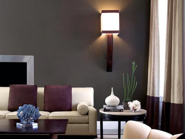
 7. Forgetting to balance with neutrals
“The biggest mistake people make when they’re trying to be colourful and exciting is to forget that you need to balance it with neutrals – otherwise it ends up looking like a colour wheel.” –Todd Klein
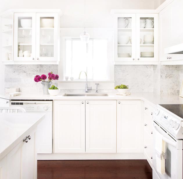
8. Going for the look, not the lifestyle
All-white kitchens, which gained popularity in the ’90s, are coming back in a big way. (Thankfully, floral furniture isn’t.) While stark white can make a kitchen look airy and bright, it can also be a pain to keep clean. And constantly wiping bolognese sauce splatters off all-white walls and cabinets would bring out the OCD in any of us. The same is true of all-white furniture. Even the best quality fabrics can’t fight off an onslaught of muddy paws or purple frosting. Don’t choose paint that looks best with white furniture if that’s not a good fit for your lifestyle.
 9. Choosing the outdoor colour inside
If you’re choosing a colour for your home exterior, remember to view and choose the colour outside. Sunlight tends to make light colours wash out and appear lighter. On the other hand, deep colours can appear brighter and more chromatic. For instance, if you’re after a dusty green, it probably will look less dusty and more bright once it’s on the walls, so be careful.
10. Forgetting the 60-30-10
The 60-30-10 principal is a good guide to keep in mind when choosing a colour scheme that works aesthetically. Split your colour choices into percentages: the dominant colour will cover 60%, while 30% is the secondary colour and 10% is the accent colour. –hgtv.com
Comment:
Talk about it!