Colours may appear different on your screen. Please check your colour on the Sigma colour-chart instore, or try a sample before purchasing.

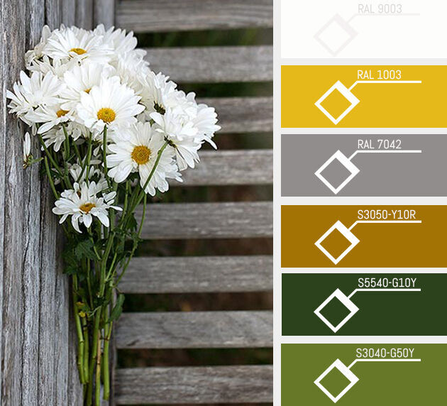
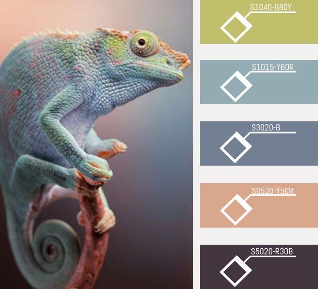
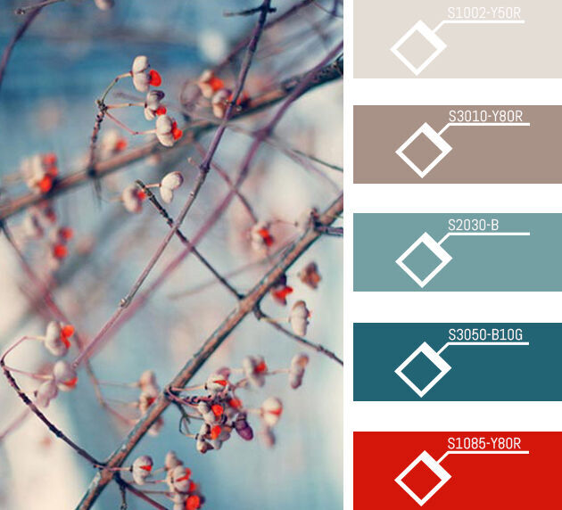
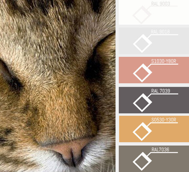
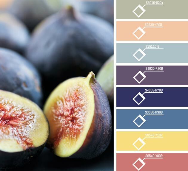
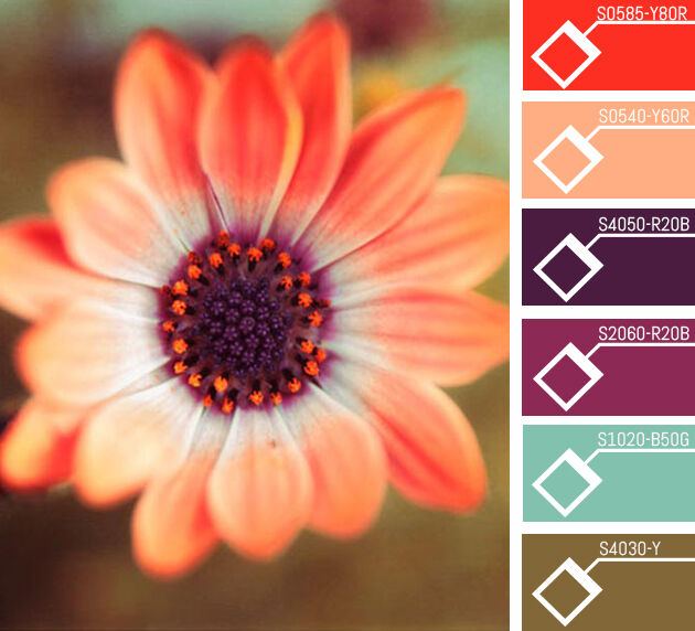
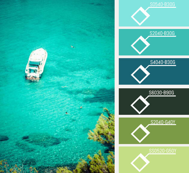
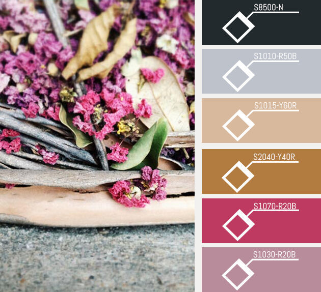
Choosing a paint palette for your home can be a daunting experience, but there’s a trick to making it easy: Look to nature! The most perfect colour combinations are always found in the natural world, so we’ve got a few palettes together to get you started.
Think about the places in nature that you like the best and start with those colour palettes for inspiration. The colours in this celadon-blue living room, for instance, were inspired by the colours of the early sunrise!
The other thing to remember when choosing a paint palette is that you need to single out at least three colours. First, you want a dominant colour for the walls or upholstery colour. In this case, that’s the celadon blue on the walls and in the armchairs. The secondary colour should be a complimentary colour to the dominant colour. Here, it’s the bright pink colour in the fabrics of the rug and cushions. Then throw in an accent colour to add interest. You can never go wrong with a sherbert or citrus color, like the yellow or orange accessories in the room. (image: BHG.com)

Now that you’ve seen the way a palette can work in a room, we’ve gathered a few of our favourite shots of the natural world to illustrate just how easy it is to pick out your own colour palette. Use these or create your own, but whatever you do, have fun with it!


Comment:
Talk about it!